Distance Pot
Source CodeOn-screen potentiometers are one of my personal annoyances. If they cease to exist, I will die happy (or at least, happier). They are particularly common in music software, where they are often such skeuomorphs that they have fake wear and tear.
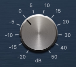
A software knob from Logic Pro's Compressor
The designers of these things get to choose one of two approaches to changing the value, neither of which make sense:
- By rotating the dial
- By moving up and down
I have never seen a touchscreen implementation that tries to use the rotation of a finger on a fixed point. I think it would be possible as a touch is more of an oval than a perfect circle.
The first doesn’t work because it is awkward (physically) to do with a mouse, and with a touchscreen you have to move the finger away from the widget to be able to rotate around it.
I have never seen a touchscreen implementation that tries to use the rotation of a finger on a fixed point. I think it would be possible as a touch is more of an oval than a perfect circle.
Interacting with a software knob.
"Forgetting an injury" is one of Bruce Lee's three most difficult things. I find it applies to many aspects of life.
The second works only after you get over the fact that the visual appearance of the widget has lied to you and actually wants to be moved vertically like a linear potentiometer. Most (but not all) modern implementations take this approach, as it works better. For anyone unfortunate enough to have experienced the rotating approach a lot, it is very difficult to forget the injury.
"Forgetting an injury" is one of Bruce Lee's three most difficult things. I find it applies to many aspects of life.
Where’s the value?
I questioned whether their popularity was really just a negative accident of history, or whether they actually had some value. Trying to see the best in their design I looked for their ‘design essence’, the features that make them useful, and came up with:
- They are a range control
- They self visualise
- They have a small foot print
Range controls are useful, often you want a minimum and maximum value of safety or usefulness. Self visualisation is also useful, they graphically tell you where the current value sits within the range. This is particularly useful if the range is cognitively unfriendly (e.g. 666 - 4235). The third property is really the key, as the first and second properties are also true of sliders. Sliders have a bigger footprint, or at least one that is sometimes more awkward.
Using these properties as my design criteria, I set out to design a new control that was better suited to the screen.
I started with a mapping of the distance from the widget –in any direction– of the input (mouse or finger) to the output range. When activated an indicator radius appears to show the position of the maximum value. This creates one form of visualisation, the position of the handle between the center and the max radius. This visualisation only works when the widget is active, so for inactive visualisation, the fill of the widget expands too.
Thinking about it now, Rather than moving a handle to a particular position, it could work better to have a circular handle that expands in all directions, so could be picked up anywhere.
While this interaction felt nice, it had a drawback. There was a missing criteria in the original spec: grabbing the widget starts adjustment from the current value. In this design, by having to grab the widget at the minimum position, you always reset the value to the minimum when making an adjustment. In a case where the control is for finding a useful value in a debug mode, this is fine, but if used as the volume control at a live gig, it would be terrible. To overcome this, I changed it so that you have to ‘pick up’ the handle from the previous position. This makes the interaction less fluid, but also less press to accidental adjustments.
Thinking about it now, Rather than moving a handle to a particular position, it could work better to have a circular handle that expands in all directions, so could be picked up anywhere.
An additional advantage gained by using a ‘move in any direction’ approach is that the widget can be placed anywhere on the screen and still be usable with a good range of movement. Regular dials can’t be placed at the top or bottom of the screen, as there is no room to go up (top) or down (bottom).
Better?
I don’t actually this is a better design, but it was an interesting exploration, and process to go through. For some other designs I like check out this article about iZotope’s design of The Gauge, and Matt Tytel’s rolly ball thing.
Demo
Try it out for yourself!
Once you’ve let go of the handle, you will need to pick it up again to make an adjustment.