Precision Slider
Source CodeThis prototype was one of a few that followed the theme of ‘what happens when we break the metaphor?’.
Sliders are a skeuomorph of linear potentiometers a.k.a “faders”, and as a result bring along the benefits and drawbacks of the past.
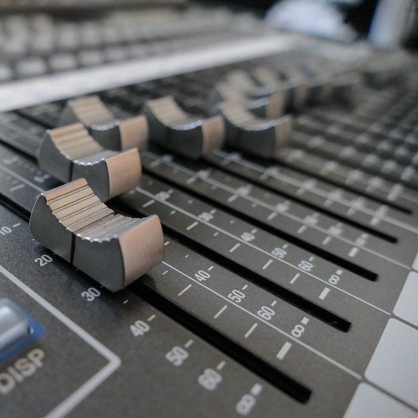
Faders on an audio mixing desk.
It's not always a requirement, we also tend to get a bit obsessive about hitting precise round numbers when given precise digital feedback.
One particular drawback when presented in a digital context is their imprecise nature. When we have precise, digital, requirements (like “that button on the website must be 234 pixels wide”) we need to have precise digital interfaces.
It's not always a requirement, we also tend to get a bit obsessive about hitting precise round numbers when given precise digital feedback.
Everyone who has used Photoshop, InDesign etc. or Music DAWs like Logic Pro or Ableton Live knows the irksome experience of using a slider to adjust a value, getting it almost right, and then spending twice the amount of time trying to hit exactly the right number.
798… 802… 799… 801… 799… 801… damnit… 800 ahh… 802 DAMNIT!
– Every graphic designer using a computer ever
The reason for this is that the user’s intention changes, while the interface does not. The user starts with the intention of finding the right value quickly and approximately , but this changes to needing to find the right value exactly. The solution often encouraged by the interface is to switch to another widget e.g. find the approximate value with a slider, then type in the exact value with a number box.
Fluency
A problem I have with this approach is that it breaks fluency. It is somewhat like changing modes, and requires a change of thinking and often of physical interaction (i.e. moving from the mouse to keyboard).
This is why I prefer to design for fluency rather than to be intuitive. "Intuitive" is often used as a synonym for "easy to use when first encountered", which often means drawing heavily on existing references. A violin isn't intuitive, but a musician can become utterly fluent with it.
My approach to interfaces has been the same as with musical instruments: the goal is to become so fluent that the interface disappears (to a degree) and the experience is of a direct connection between your ideas and the output. The interface is one of the biggest deciding factors in determining how fluent an interaction can be (another being the mental model being employed). This isn’t to say that this connection doesn’t have to be learnt and practised, but some things are easier to learn than others.
This is why I prefer to design for fluency rather than to be intuitive. "Intuitive" is often used as a synonym for "easy to use when first encountered", which often means drawing heavily on existing references. A violin isn't intuitive, but a musician can become utterly fluent with it.
This slider tries to offer control over precision, while staying within the mode of interaction. It does this by breaking the metaphor, having multiple handles which can be moved independently. The keyboard is used to switch between the different handles so that they are not accidentally nudged when moving one of their neighbours.
Demo
Reference
One of my references for this design was Apple’s variable speed video scrubbing on touch devices, where the finger can be moved vertically to adjust the horizontal scrubbing speed. I wanted to take a different, more graphical approach. The Apple interface has no signifiers that different speeds are possible, and in iOS 11 has no feedback (in iOS 10 the scrubbing speed appeared as text).