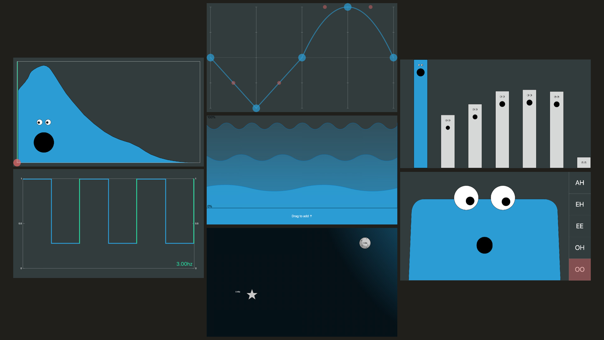
Design Sound
Try the app: designsound.app
This web app was built for my Today at Apple event, as vehicle to help explain the concept of sound design to a lay audience; to explain the parts of a sound (such as the envelope) that make a violin sound different to a piano. For me it was an opportunity to design bespoke widgets for controlling synth parameters.
The app consists of seven widgets, designed to be “touch first”, that each control one aspect of the sound: the envelope, waveform, harmonics, a filter, an amplitude modulation LFO, chorus, and reverb + echo.
I had great help from the wonderful Oscar Dub, and the UIs were built in TypeScript using Karsten Schmidt’s fantastic thi.ng umbrella libraries.
While the primary goal of these interfaces was for them to be approachable and understandable for people who had never used a synthesiser, I wanted the results to be valuable –and in some cases, even preferable– for people who are familiar with synths. One approach was to design them to be visually descriptive of their function, rather than using abstract sliders and knobs to control parameters, e.g. the LFO interface is a draggable, snappable, visualisation of its effect on the amplitude over time.
The playback controls on the app were heavily constrained, just three buttons to play either a single note, a chord, or a short melody. This was so that while people were playing with the app, the whole room would be in the same key, and so that the focus was on the sound design aspect of music making. Preset controls were also provided as starting points, and to demonstrate variety.

Playback Controls
Presets
Design Thoughts
Layout
Starting from a “touch first” perspective was interesting. I definitely wouldn’t have made the envelope drawing UI for mouse input, and without thinking about it I went for widgets that were full-screen as scrolling is such a natural thing to do on a touch device. I don’t think so much scrolling would work in a professional setting, but the precision that large widgets allowed is useful, and I do think it is worth experimenting with dynamic screen real-estate (scrolling, zooming, resizing). A layout with less scrolling could look something like:
An alternative layout designed for the desktop screen
Faces
I wasn’t sure about the faces, but once Oscar and I had the face on the Filter Interface working there was no going back! My style isn’t usually cute / playful, but I wanted to try something different and was inspired by Matt Irvine Brown’s The Tune Zoo, and Durrell Bishop’s work.
Envelope
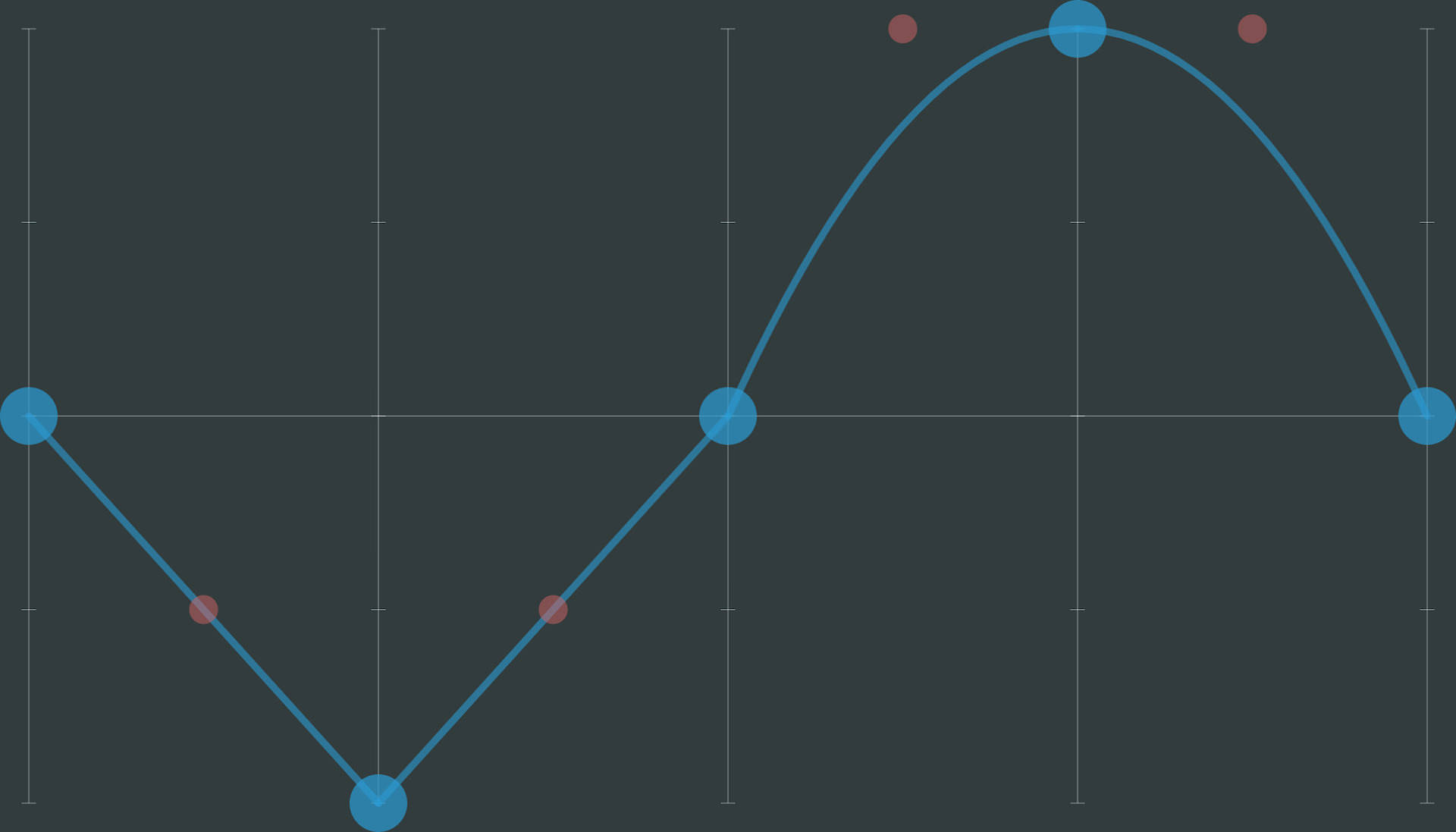
Having already redesigned an envelope prototype (as a voice UI) I was actually quite happy with this one. I found a lot of people liked the freedom of drawing, and it gives a good visual representation of the envelope. The interface is “one shot”, you have to grab a handle to draw, which resets the envelope. This was because it was difficult to design and build a good interface that would allow for edits. That said, I think it can sometime be a good idea not to allow users to infinitely edit things, and instead guide them towards commitment. In the future I would like to try a version that uses something like the “As Rigid as Possible” algorithm.
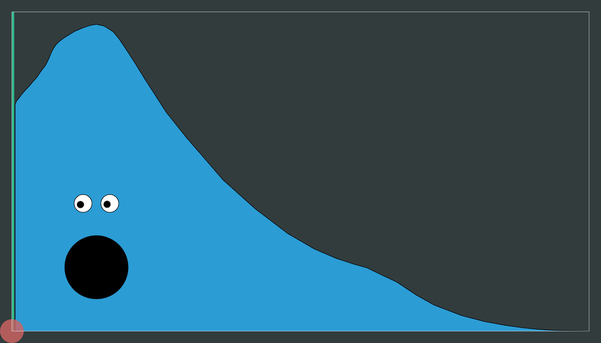
Envelope Interface
I had wanted to have the eyes follow a marker than moved from left to right as the envelope played but it never got to the top of the priority list (the green line is still there on the left, but stays still; no-one has ever asked about it).
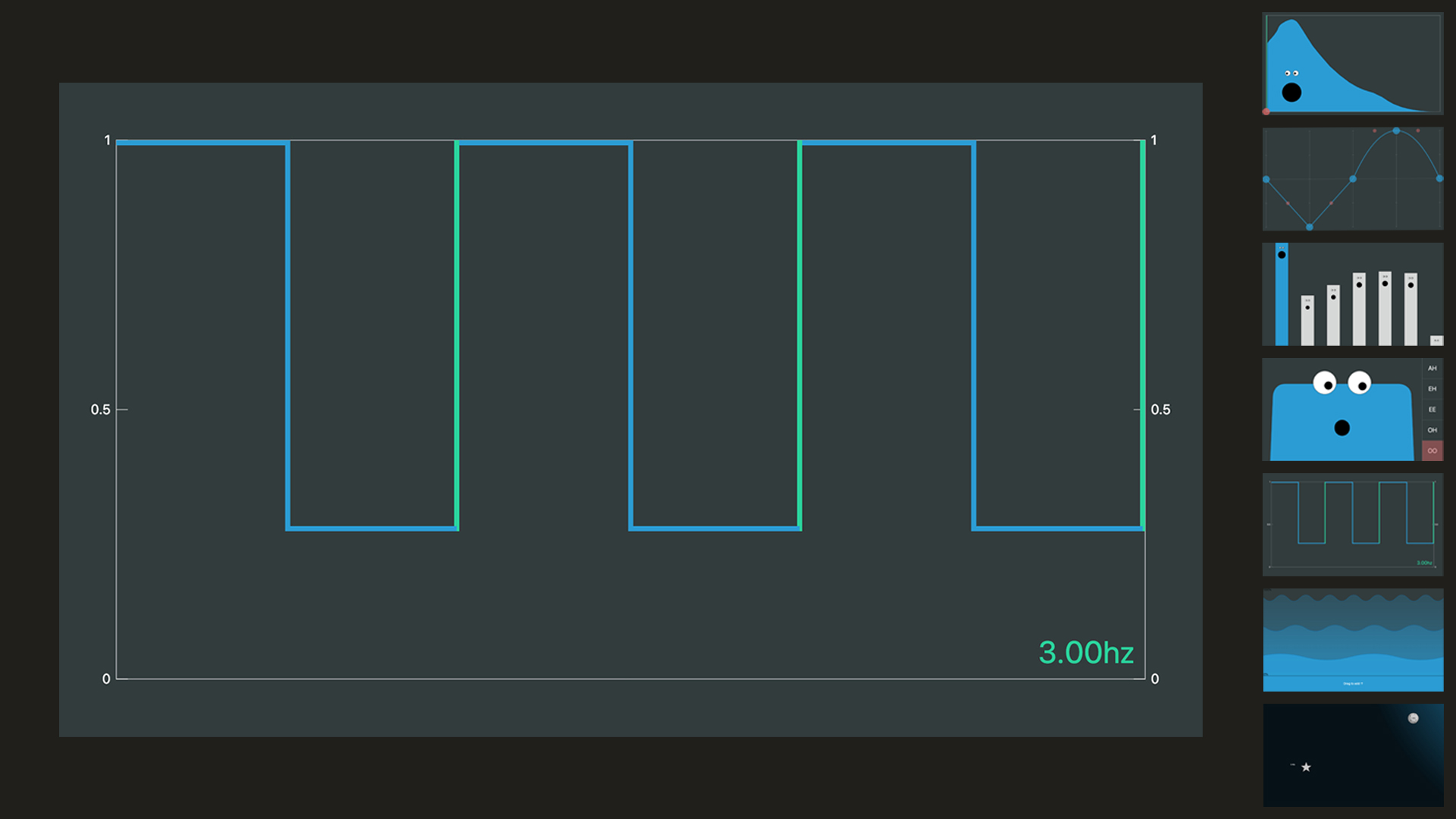
Waveform
I had wanted to create something like this for a long time, where rather than selecting from a set of preset waveforms, you could just interact with it directly. Initially I tried a drawing interface similar to the envelope, but everything sounded noisy because of the difficulty in drawing smooth lines freehand. I then tried adding a set of cursor tools with different shapes (a circle, rectangle, triangle) that could be used to manipulate a line. In the end I went with this handle based approach, which I was really happy with in terms of interaction. It allows for smooth straight lines and curves, while still being flexible enough to allow a lot of manipulation. I was particularly happy with the “double tap to straighten a segment” gesture. The somewhat disappointing thing the amount of variation that actually seemed to be possible. The implementation (just filling an audio buffer with samples of the lines) is also not ideal, e.g. square waves are usually the sum of a set of sines.
Waveform Interface
Harmonics
A bit of a fun one, somewhat like the draw bars on an organ, or worms coming out of the ground…
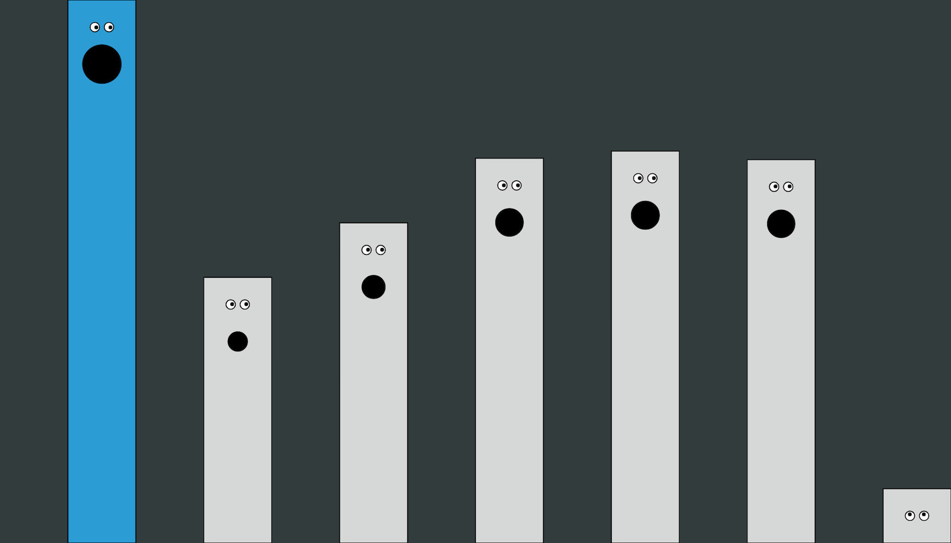
Harmonics Interface
Filter
Definitely aimed at being more fun than a good filter interface. Oscar ported a bunch of csound vocal synthesis code to TypeScript to make this work. We wanted to add a vibrato control as well (which ramps up the vowel effect) but ran out of time.
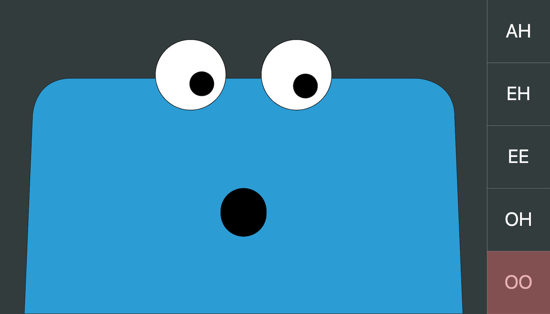
Filter Interface
LFO
This LFO was applied to a gain node to create amplitude modulation. I like how this UI uses direct manipulation and is visually descriptive of the effect. My favourite feature is the snapping of the green vertical lines to the edge of the window. In this case it assumes a tempo of 60bpm but this could be adapted to any tempo. I would like to make a version of this with a smaller footprint.
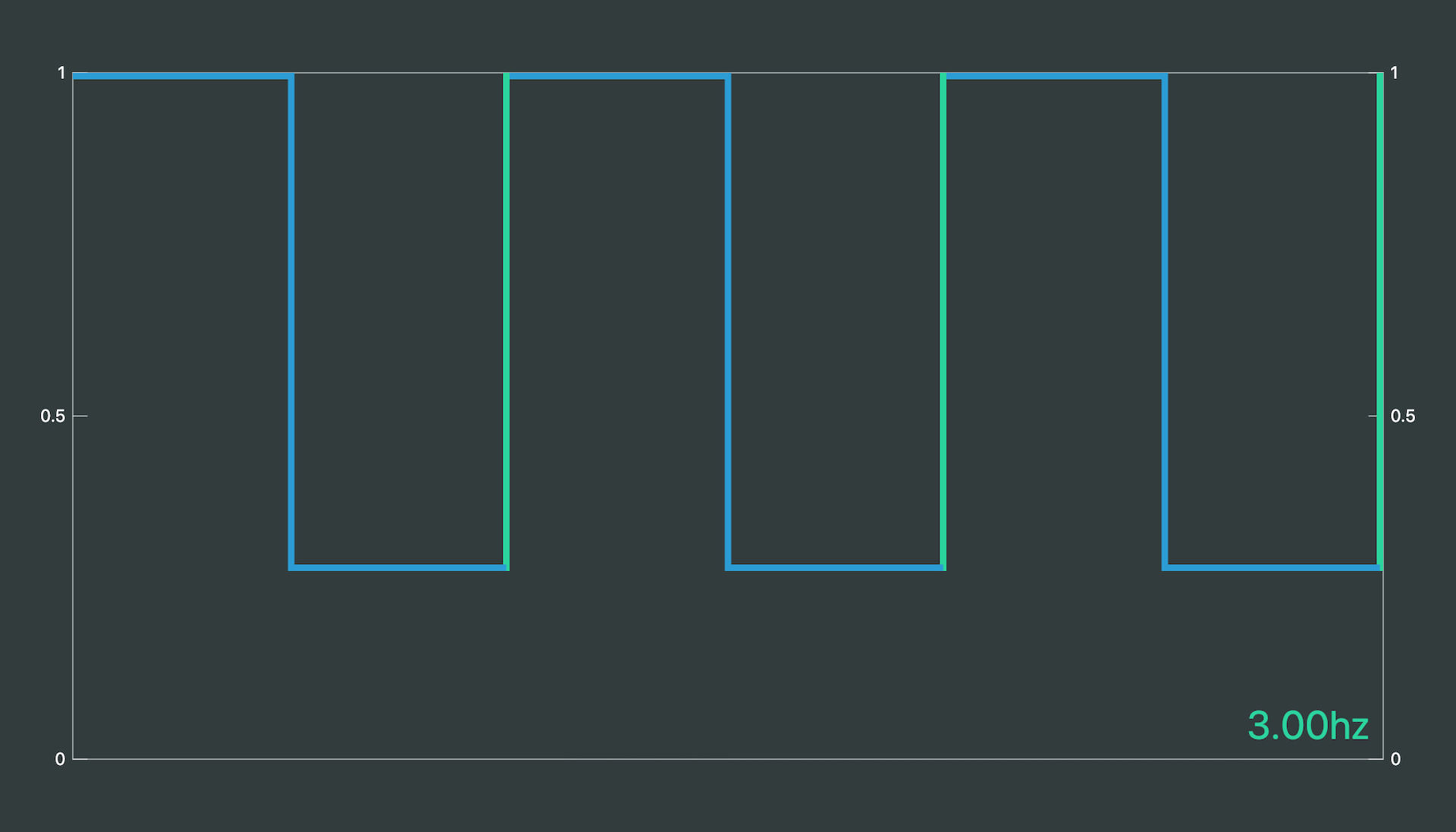
LFO Interface
Chorus
I still vividly remember the first moment I tried my friend Pat’s Boss Super Chorus, I thought it sounded like water, and I guess the colour stuck with me.
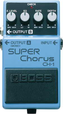
Boss Super Chorus
I think this interface looks quite nice, and provides reasonable high level control over the chorus parameters (y axis is mapped to volume and depth, x to frequency), it doesn’t provide enough for a studio tool.
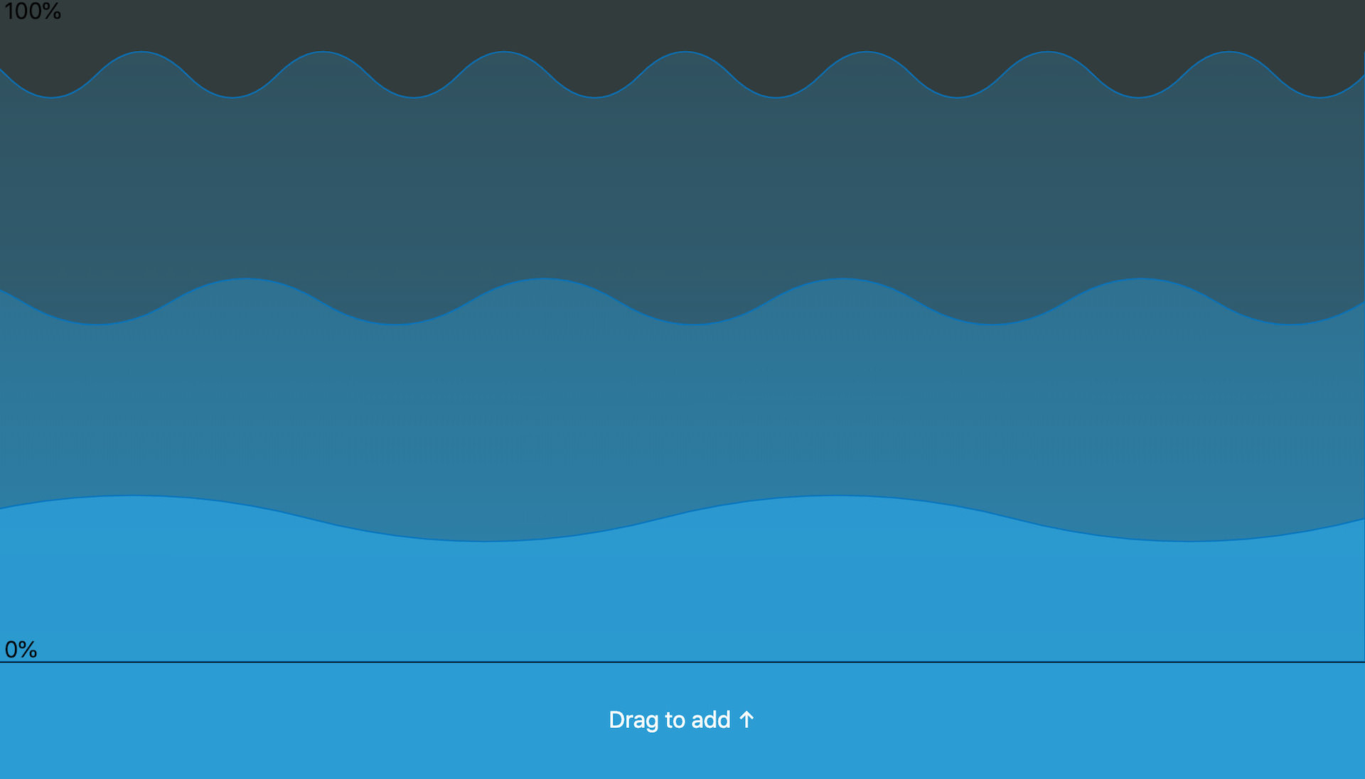
Chorus Interface
Reverb and Delay
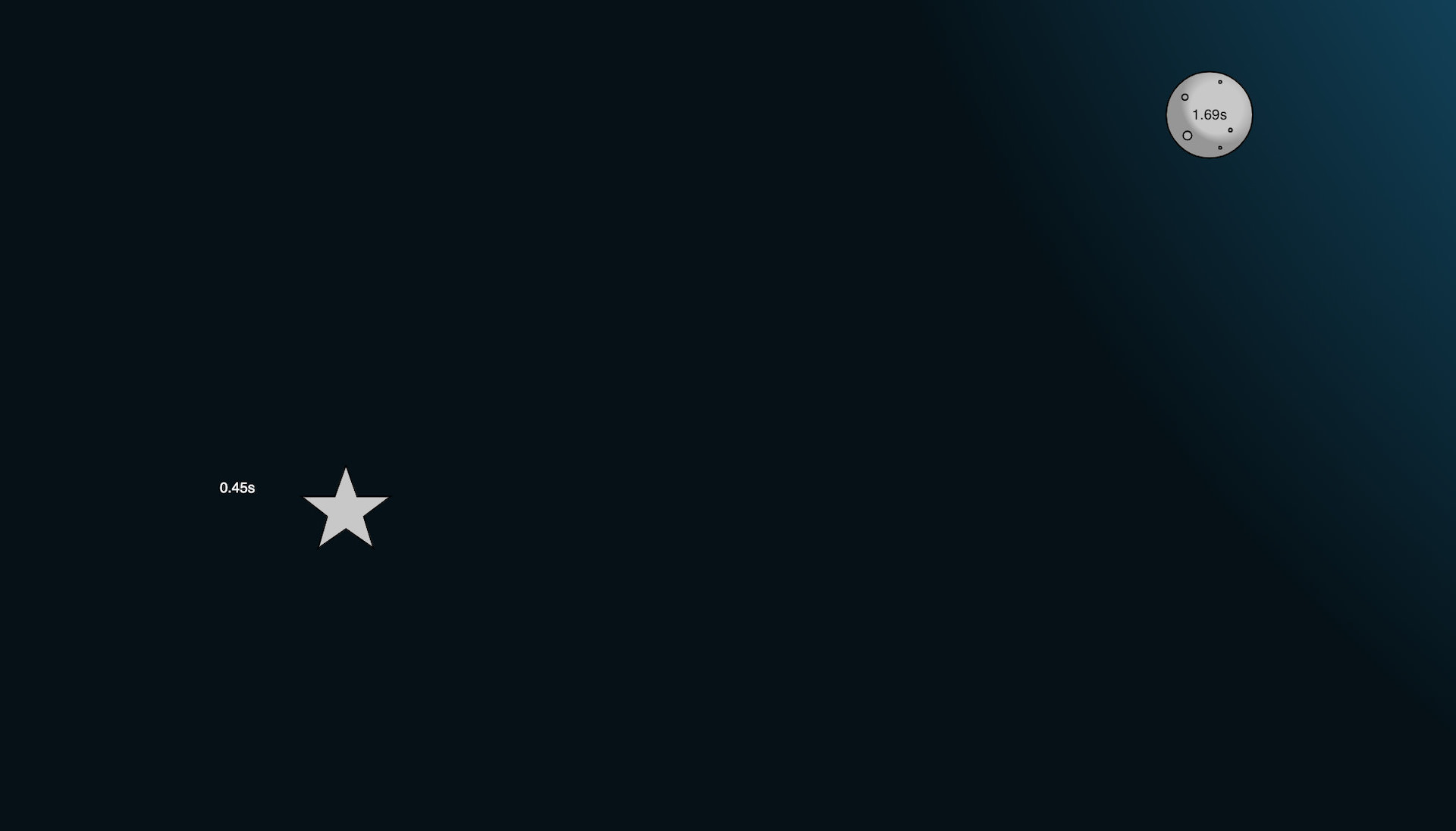
Delay + Reverb Interface
I’m not a big fan of metaphor or “imagery” (for want of a better word) for interfaces, but I always felt that big, long tail, reverbs sounded like the night sky to me, so I decided to add a bit of embellishment to these two XY sliders. Oscar pointed out that if I were actually going for metaphor, it should be a hall or cave that could be resized. Fortunately there wasn’t enough time to rebuild it as I definitely think my visual artistic skills would have let me down. I had wanted to add a trail to the stars to show the feedback tail, but again time got the better of us.
App
As mentioned, the app was built using TypeScript and the thi.ng umbrella libraries. It was a bit of a gamble to use these, as it was my first experience with them, and some of them were relatively new at the time. After a weekend of prototyping with the hdom-canvas package I decided to commit. The fact that it is not a framework meant that is was easy to integrate some of my old audio code, and to write code in a familiar style when fully adopting some of Karsten’s patterns was too much of a learning overhead.
The audio was all written using the Web Audio API directly. I did also pinch a couple of bits of code from Tone.js for the chorus and reverb effects (thanks Yotam!).
Interfaces
A really useful feature of TypeScript is interfaces, which let you define the shape of objects without any implementation. I found it extremely useful to create these for the WebSocket messages and use the same definition for both the client and server code, ensuring that any changes were kept in sync.
export interface INote {
  note: number;
  durationS: number;
  gain: number;
  synth: Synth;
}

export interface INoteMessageData {
  musicianIds: number[];
  startTimeS: number;
  note: INote;
}
Thanks
Thanks again to Oscar Dub for his great work on this!